I have asked myself this question to better understand what I want and don't want in my own work. After looking at many painting on Pinterest, I decided to write down my observations with examples to clarify this in my mind and to discover something I didn't know before. I have left off the artist's name and title to stay focused on the painting.
Overwhelmingly the table is used. Very often cloth and objects drape off the front edge of the table.
The shelf has one or more objects and sometimes part of the object hangs over the edge.
Chairs and other furniture provide a flat surface and break up the picture plane more than a table.
The more I looked the more I found books in paintings used as a surface for objects.
Windows are used outside looking in or inside looking out depending on where the sill is located and the light conditions.
Boxes, mostly made of wood, provide a space, surface, and framing for objects.
The corner provides three surfaces.
The wall shows a vertical surface with a top view of the object. Looking down on a table there is a horizontal surface with a top view of the object.
Niche comes from the Latin for nest and has been used in paintings for centuries.
It is my observation that artists automatically use these nine basic surfaces when planning a still life. So I searched for artists who didn't use these ideas or modified them.
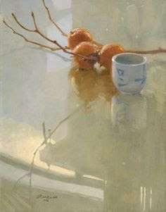
This artist used a table with a cloth hanging over the edge but changed it by casting light through the fabric thus making it semi-transparent and adding another element to the painting.
I know there is a table underneath but the artist has down played it and changed the back ground plane so it tilts back unlike a vertical wall. The tilted backgrounds hides the real shape and size of the table.
The surface in this painting looks like a glass table reflecting the objects and a window. The artist has given just enough information without competing with the center of interest.
In this piece the surface serves its purpose without identifying what or where it is. It is smooth enough to show a reflection and that is all that matters.
There are a lot of interesting objects out there that act like tables, but are not tables.
Hmm, flowers sitting on a shadow of a chair on a wooden floor instead of a vase of flowers on a chair.
There are two unknowns in this work, what the jug is sitting on and what to call the background. The jug and negative space are both the same color and value to show off the center of interest, the daffodil.
Letters and words as surface.
The squash is so large that it becomes the surface.
An arial view of a rug on the floor is the surface for the subject.
This painting makes me want to search for new surface possibilities.
I assume the toaster is on a kitchen counter but it is secondary to the surface of the toaster that reflects the plug which is the center of interest. Reflective surfaces can be a place for still life objects.
The copper cup is on a flat surface that functions in realistic space like a table but it isn't a table. Furthermore, it can't be named other than the description of positive, flat shape. The background and foreground can't be names either all of which adds mystery to this composition. The flat shape also creates interesting negative shapes far more than a rectangular table.
I now realize surfaces for objects to sit on don't have to be exactly painted as seen. They can be suggested, hinted at, mysterious, unnamable, reflective, out of context, unseen, and surprising. I'm going to carry these observations into my painting when I set up my next still life. This will allow me to break away from the nine overused standbys as previously described.


No comments:
Post a Comment